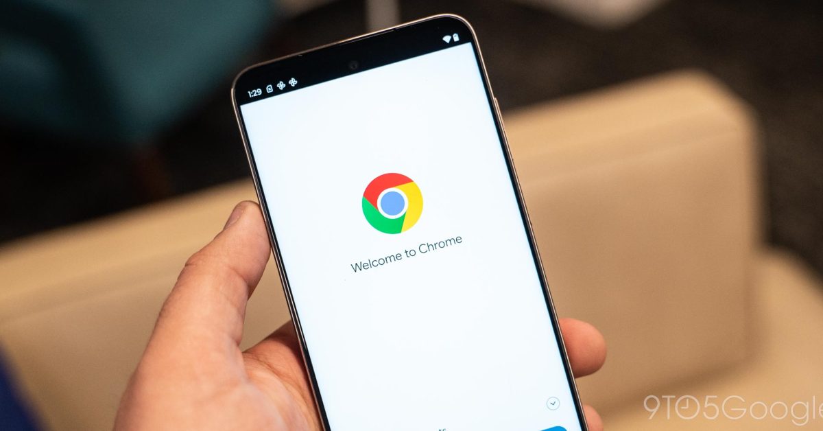
I so much want Holo style back
Holo was finally starting to look really good. Google had got around to making most of their apps Holo, they had improved all the rough edges and inconsistencies, and then they pushed out Material design.
Don’t get me wrong, I don’t hate material design, but it seems like such a wasted effort restarting all that nonsense again.
Sadly Firefox is going the complete other way and not even introducing a smidgen of Material You in its redesign.
Yeah Firefox is looking really dated now imo.
I’ve seen some of what’s on the horizon, a new UI is incoming
The new Material design doesn’t look good to me so, personally, I see that as a good thing
Each to their own. I’m enjoying how my phone looks. It can be improved for sure, but it’s certainly not bad.
Sometimes I wonder if the reason is because Mozilla doesn’t want to associate their browser with Google. It’s just kind of a wild guess, but that’s kind of what I think. But then again, Mozilla has some really weird branding fetish
I would kill for at least an amoled theme for Firefox. The light gray is way off compared to other apps.
While not quite what you’re wanting, this is a definite step in the right direction.

deleted by creator
I really don’t understand the Material allure.
I build web apps as a job and the impression I get is that everyone wants Material, “because” - but I don’t know if anyone wants it other than “because” it’s the buzzword of the day.
And it always sucks because the clients always say, “Follow Material guidelines BUT make this smaller, make this less round, use this font we paid for, make the buttons different, and also customize all these components”.
It’s dumb.
The guidelines are a culmination of well-researched UX basics in practice. They’re meant to be stylistically customizable to any brand, or user preference. It’s just the best starting point in software design at the moment.
It’s just a design system from Google: https://m3.material.io/
I’m ok with material design (even have a Pixel 7, so I see it all the time), but I really wish the accent colours would have a little more saturation.
No matter what my wallpaper is, my buttons all just kinda look like off-white, and I think that makes it less legible, particularly annoying because my eyesight seems to be getting more iffy as the years go on.
I just want the option to have a more vibrant accent colour, as opposed to looking like a white piece of paper that a smurf has lightly breathed on
You can choose a more vibrant color in the settings. Swipe on the pallete list and look for more.


