- cross-posted to:
- technology@beehaw.org
- cross-posted to:
- technology@beehaw.org
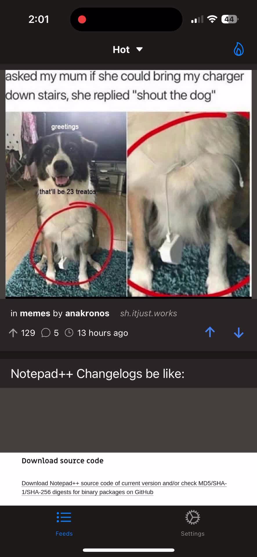
Feel free to download and test yourself by joining the TestFlight group.
https://testflight.apple.com/join/6jaRU6rD
Please leave feedback either here or on GitHub.
Note this is very much a work in progress still and this is very barebones. I plan to continue work and submit nightly builds on TestFlight, so be on the lookout for the new releases.
Happy scrolling!


Dark theme looks great, I really like the choice of tones. Way better on the eyes.
When you look at your communities subscription list, the list appears as the previous “light” theme instead of dark.
In addition to my comments from yesterday… when I reply to a post - the Reply Screen does not reference the comment/post I’m replying to. If someone has a long post that requires a long response, it would be nice to reference what was originally written without possibly accidently backing out of the reply.
Minor thing. Your community is headlined “an iOS client for Lemmy” and that’s what pops up when you search All Communities on Lemmy.ml. No mention of Memmy unless you look at the address bar. I’d recommend updating it to “Memmy - an iOS client for Lemmy” so people know what it is.
Thanks for the feedback!