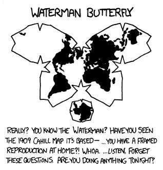
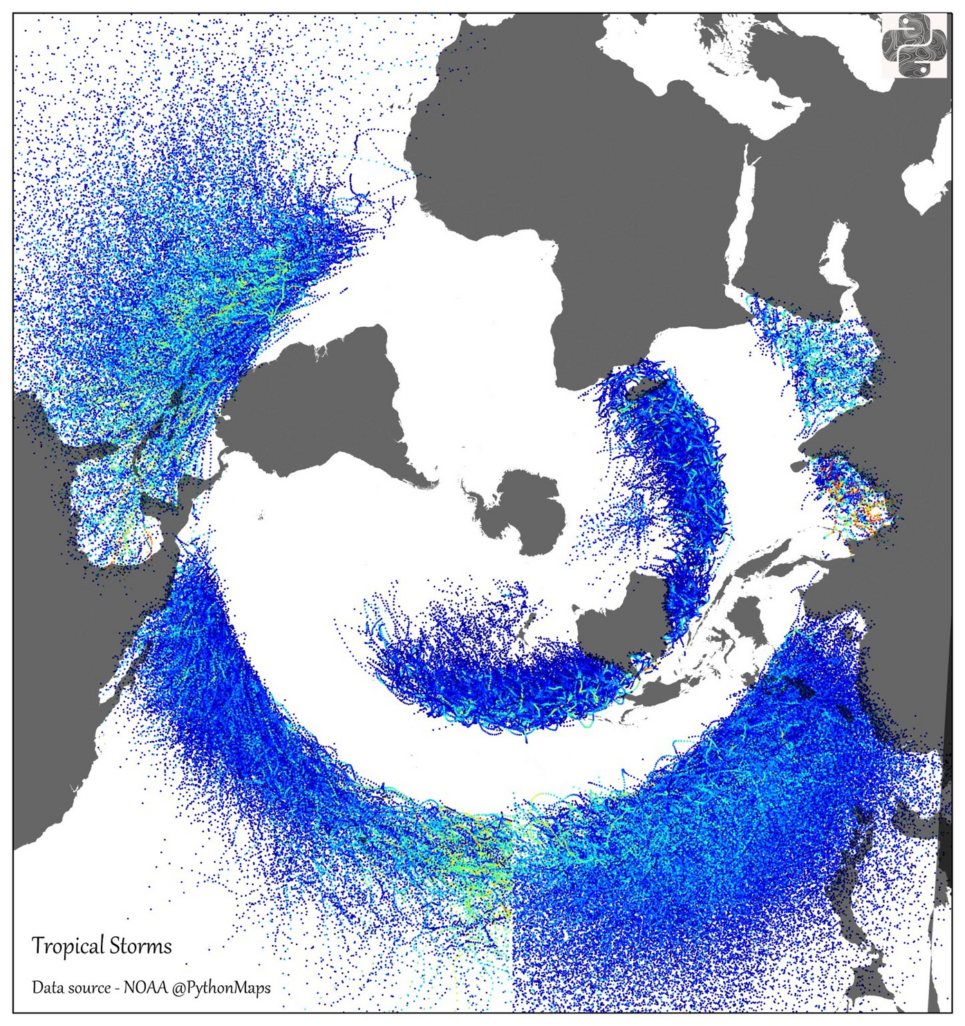
For some reason, this projection is just really messing with me. I can recognize, with a bit of effort, the continents, but their relative sizes and positions is just making it tough to really follow what I’m guessing is an argument on storm patterns.
Can I suggest pushing out a visualization that uses an interactive 3d globe model instead of a single jpg? I feel like if I could scroll up and down between a normal sized Antarctica and a normal sized North America, my brain would be less confused as far as interpreting patterns and interactions goes.
If it helps you, the hurricane belts do have the equator nicely between them.
Oh damn, that’s the equator. It looks so non-centric here I didn’t even recognise it.