
Hi all! I’ve gotten permission from @lFenix@lemmy.ml to start a thread here about changes to the logo/identity system for mlem.
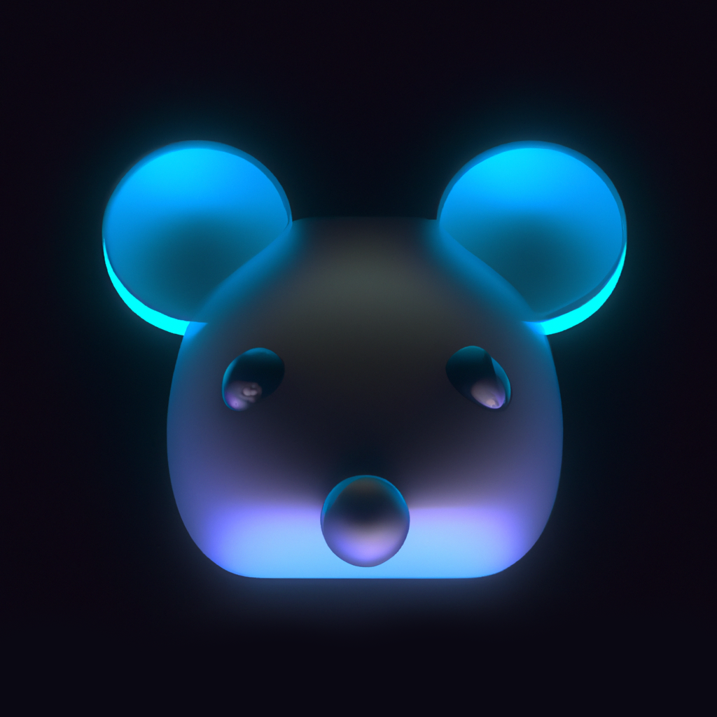
This is the current mlem logo:
To start with, I have some thoughts, and a bit of a history lesson that can help inform us as to what directions we want to go in:
Lemmy was named Lemmy because of two reasons:
-
The creator of Lemmy was fond of the game Lemmings, wherein the player leads an ever-increasing line of rodents through a puzzle to avoid certain doom (or towards their certain doom - you decide). (It might also be useful to note that at the height of its popularity, the Lemmings game was targeted and labeled a “satanic” video game by certain far-right christian groups, due, ironically, to the whole “leading a group of mindless entities to their certain doom” idea, and also primarily because there were levels that appear to take place in a hellish cavern, where you lead the lemmings into the mouth of a demon.) This is all part of the “Satanic Panic” often found among far-right groups who believe in Satan, and are afraid of him.
-
Lemmy from Motorhead had just recently passed away, and so as a way of honoring Lemmy from Motorhead, they named it Lemmy.
Regarding the Lemming rodent itself: In popular culture, a longstanding myth holds that they exhibit herd mentality and jump off cliffs, committing mass suicide.
This myth was created and perpetuated by Disney in their 1958 “nature documentary” film “White Wilderness” wherein they staged a mass-suicide of lemmings that they had imported to Alberta Canada from Manitoba specifically to stage and film this myth.
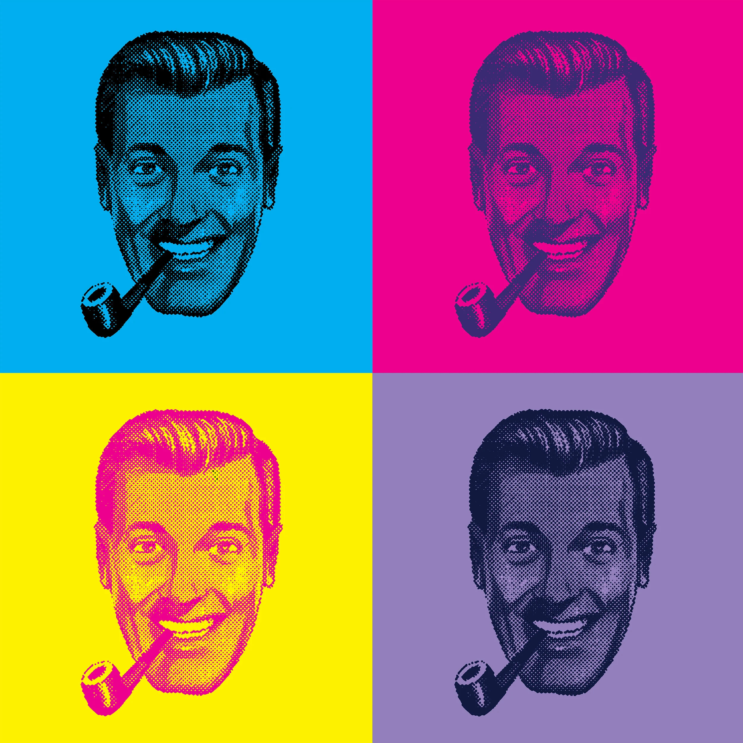
The current mlem icon look seems really close to the Mickey Mouse logo, especially at a small icon size, which is why it struck me that maybe we need a new logo for this app, at the very least.
I’m also not sure how closely we want to try to associate with Lemmy from Motorhead. He was a great guy, by all accounts, but I’m not sure what his estate would say about it, nor do I think there is much mass-recognition or mass-appeal in going that route.
A few questions:
-
Are we married to the name “mlem”?
-
Do we want to emphasize any of the particular letters in the name? For instance: “mLEM” or “mLem” or “MleM”?
-
What is our primary audience going to be? Are we looking to appeal to feminine equally as well as masculine and androgynous?
-
What logos and identities do you think currently do a good job of straddling that line of appealing to the entire spectrum?
-
This is a mobile iOS app, so do you feel like we should make sure that it feels like it belongs within that ecosystem?
-
Should the emphasis be to make it fit within the overall Lemmy GUI ecosystem itself, adhering to and following the default GUI design of the default Lemmy instance installation, and change with that as it changes?
-
Should the default icon style be ever-changing, similar to how Apollo’s icon designs were customizable?
-
Even if the styles and aesthetics change, the actual logo for the app should probably remain consistent.
-
Color theory should be applied to the default aesthetic of this design, of course, so I’ll give you a link to the emotional/cultural impact of colors to inform those decisions. If this app is going to be used worldwide, we will need to take into account cultural variations in terms of color interpretation.
-
Given that lemmings are native to the arctic tundra, should we take that into account in the design/coloration? Using whites and blues to bring to mind ice and snow? Or is that too cold/forbidding, and we want to be warmer and more inviting?
Any other ideas to consider?
Yeah, same here. I definitely want to keep it. The icon needs to really convey that concept clearly.