Just remove the fullstack part. If there are any senior developers going through the CVs, that’s an immediate red flag.
Why? The “stack” has grown so large, that when a dev claims to be fullstack, you know he either doesn’t understand enough to know he cannot be a fullstack developer, or he does, and isn’t really good at anything, because there’s just too much to know these days.
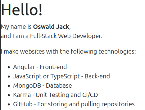
The second column seems clunky to me. I know what everything in column 1 is for. Column 2 seems redundant or filler. For a keyword search or something like an ATS having those things mentioned is probably helpful. Though, for an ATS you should be optimizing for that separately.
Right now the About Me page doesn’t tell me anything that I won’t find out on the Resume and My Projects pages. I would get annoyed at having a wasted click for no new information, and it tells me that you’re just putting stuff on a page for filler. Maybe consider combing the About Me and Contact Me pages.
On the about me, you may want to add a portrait and some biographical information. Nothing too personal. The stuff you would like to share an icebreaker in an interview. It’s a good way to provide a conversation starter, “Hey, I saw on your page that you like kitties and hiking. I like kitties and hiking.” I had my HVAC serviced last week, and the company sent me a text with a photo of the tech and some general biographical info on it. Apparently the guy likes going to the gym and spending time with his family. I don’t know why I needed to know that, but now I do. Humans are social animals, and a lot of humans like that kind of stuff. The portrait doesn’t have to be anything professionally done. Any decent phone has a portrait mode. Just look nice and use a clean background. Don’t use the webcam on your monitor with your unmade bed in the background.
Also, this page tells me you are more of a back end person. Someone more front end would be a little more creative on the graphical design. This looks like a default template. That’s fine if that’s the message you want to convey. That’s what my stuff looks like. I mostly do data engineering and present those data in an interactive dashboard with some manipulation and filters. In that situation having a boring and generic looking dashboard is desirable. My users prefer that since they are really there for the data and controls, and anything extra would be a distraction. If you want to convey that you are more front end focused you need a less tabular layout and more visual candy.
I understand what you’re saying, but I designed my website to be short and sweet, something that can be skimmed through and move on.
Maybe consider combing the About Me and Contact Me pages.
Can you expound?
For a keyword search or something like an ATS having those things mentioned is probably helpful. Though, for an ATS you should be optimizing for that separately.
I asked ChatGPT to make an ATS friendly change to the About Me section. Is this what you mean, and can it be beautified with the ability for the ATS to go through it
I think we need to take a step back and add some context. Every company will have their own hiring process, but they are mostly the same. Where I work it goes like this.
A hiring manager sends a job description for an employee they want to hire
The recruiter will check the job description for any problems and make it public
Usually, a few hundred applications come in. Some are these are from bots. Others are from people applying for every open position at the company.
The ATS will score the application and resume by comparing it to the job description. Some will look at your social media like LinkedIn and Facebook. Mostly if you provide those links.
The recruiter will then start trying to find the best candidates to send to the hiring manager. They do this by looking at how the ATS scored the applicant and prescreening calls. They mostly check to make sure you are a human and that the stuff on your application is correct.
The recruiter then sends candidates to the hiring manager. There is no hard policy on the number of interviews the hiring manager has to do, but the goal is under 10.
The hiring manager does an initial interview with the candidate. Depending on the situation this is in person, over video, or a phone call.
If they pass the interview with the hiring manager then 2 additional group interviews are usually setup. One with stake holders and another one with peers. At this point it’s usually down to one person. These are sort of like veto interviews.
Once someone makes it through all this does the recruiter make the offer and start to discuss, background checks, salary, and if needed relocation and immigration sponsorship.
During this entire process the only people that are going to look at your website are the hiring manager, stake holders, and peers. That is only if they are feeling motived to do additional research on you after having looked at your application and resume. Your application and resume should have already told them that you know the technologies you listed. This means that the user is not rewarded with any additional information. What was the point of me seeing this page? As one of those people interviewing you the only thing this page actually tells me is that you know how to put words on page with a template. That template should be custom and look amazing.
Jeff Geerling’s website is a good example for content. The design isn’t something I would expect from a front end developer, which he is not.
Nowhere does he have a list of icons of technologies used. You learn that he knows how to use git by the link to his GitHub profile. He doesn’t have a dedicated contact page. The only thing that is really needed is mention an email address on the about page and links to socials. It’s almost like he shows us his skills instead of telling us about them.

Just remove the fullstack part. If there are any senior developers going through the CVs, that’s an immediate red flag.
Why? The “stack” has grown so large, that when a dev claims to be fullstack, you know he either doesn’t understand enough to know he cannot be a fullstack developer, or he does, and isn’t really good at anything, because there’s just too much to know these days.
Here you go, I hope to reach to the Senior Developer’s level one day:
The second column seems clunky to me. I know what everything in column 1 is for. Column 2 seems redundant or filler. For a keyword search or something like an ATS having those things mentioned is probably helpful. Though, for an ATS you should be optimizing for that separately.
Right now the About Me page doesn’t tell me anything that I won’t find out on the Resume and My Projects pages. I would get annoyed at having a wasted click for no new information, and it tells me that you’re just putting stuff on a page for filler. Maybe consider combing the About Me and Contact Me pages.
On the about me, you may want to add a portrait and some biographical information. Nothing too personal. The stuff you would like to share an icebreaker in an interview. It’s a good way to provide a conversation starter, “Hey, I saw on your page that you like kitties and hiking. I like kitties and hiking.” I had my HVAC serviced last week, and the company sent me a text with a photo of the tech and some general biographical info on it. Apparently the guy likes going to the gym and spending time with his family. I don’t know why I needed to know that, but now I do. Humans are social animals, and a lot of humans like that kind of stuff. The portrait doesn’t have to be anything professionally done. Any decent phone has a portrait mode. Just look nice and use a clean background. Don’t use the webcam on your monitor with your unmade bed in the background.
Also, this page tells me you are more of a back end person. Someone more front end would be a little more creative on the graphical design. This looks like a default template. That’s fine if that’s the message you want to convey. That’s what my stuff looks like. I mostly do data engineering and present those data in an interactive dashboard with some manipulation and filters. In that situation having a boring and generic looking dashboard is desirable. My users prefer that since they are really there for the data and controls, and anything extra would be a distraction. If you want to convey that you are more front end focused you need a less tabular layout and more visual candy.
I understand what you’re saying, but I designed my website to be short and sweet, something that can be skimmed through and move on.
Can you expound?
I asked ChatGPT to make an ATS friendly change to the About Me section. Is this what you mean, and can it be beautified with the ability for the ATS to go through it
I think we need to take a step back and add some context. Every company will have their own hiring process, but they are mostly the same. Where I work it goes like this.
During this entire process the only people that are going to look at your website are the hiring manager, stake holders, and peers. That is only if they are feeling motived to do additional research on you after having looked at your application and resume. Your application and resume should have already told them that you know the technologies you listed. This means that the user is not rewarded with any additional information. What was the point of me seeing this page? As one of those people interviewing you the only thing this page actually tells me is that you know how to put words on page with a template. That template should be custom and look amazing.
Jeff Geerling’s website is a good example for content. The design isn’t something I would expect from a front end developer, which he is not.
https://www.jeffgeerling.com/ https://www.jeffgeerling.com/about
Nowhere does he have a list of icons of technologies used. You learn that he knows how to use git by the link to his GitHub profile. He doesn’t have a dedicated contact page. The only thing that is really needed is mention an email address on the about page and links to socials. It’s almost like he shows us his skills instead of telling us about them.
I see so make the website look like a resume, genius.