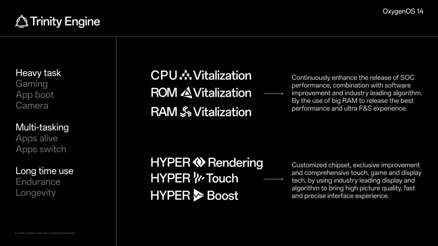
By the use of big RAM to release the best performance and ultra F&S experience.
Big RAM striking again, smh my head
Just guessing here, but maybe they just mean “their” feature where they use some internal storage as a swap file or partition and then call it “RAM expansion” or “virtual RAM”, and this time they probably decided to call it “big RAM”. But that thing is already natively supported by Android since it’s based on Linux anyway, it’s just that most phone manufacturers don’t use it for different reasons (could accelerate wear on the internal storage).
My comment was mostly tongue in cheek, but I agree with you.
Based on how weird some of the sentences sound, (to me) it looks like the slides were translated from another language into English, which could explain the odd naming (and grammatical errors).
No, my dude. This is the “breathless marketing speak” as pioneered by Applel.
OOS 12 was a mess on my OP7 pro. Moved to Crdroid and am happy with it. Got another update for it just this morning. If this were even an option on my perfectly fine phone, I still wouldn’t consider it.
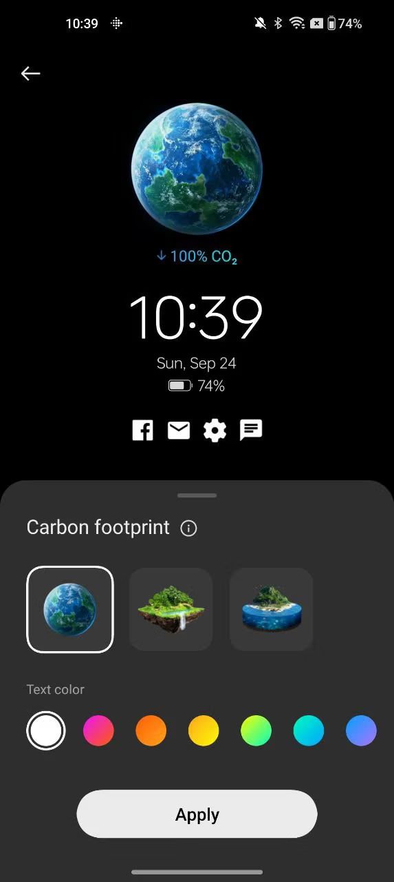
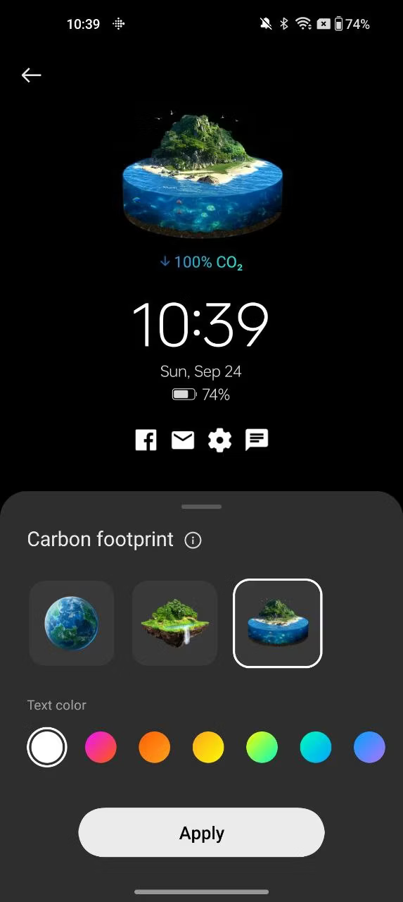
I’ll rest easy now that my phone will have downward 100% lower carbon footprint. What about you guys?
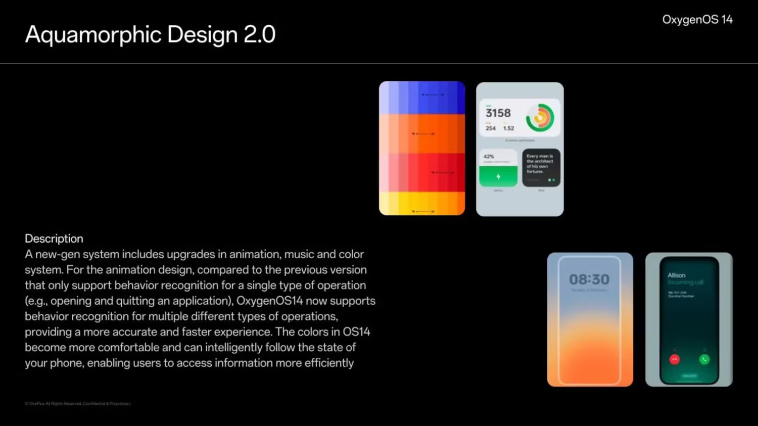
Aquamorphic Design
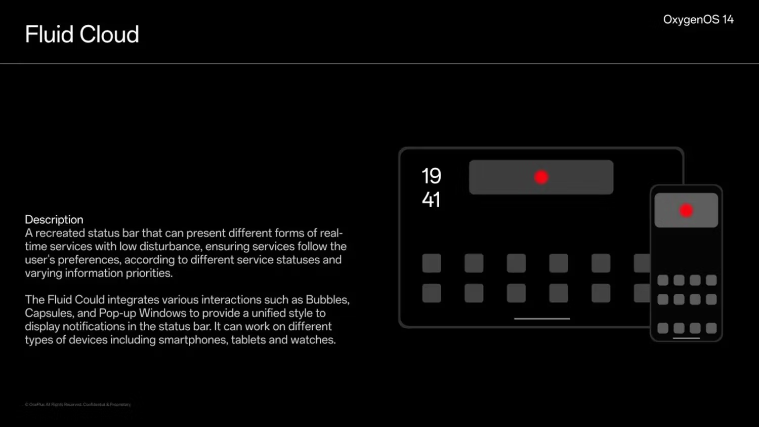
Fluid Cloud
Why are all the descriptive adjectives so “wet”, when water is the last thing you ever want to get near your phone?
They centered their UI marketing around water:
Aquamorphic Design uses the overarching inspiration of water to blend innovation, adaptability to changes, and intrinsic simplicity into its OS design.
(https://ifdesign.com/en/winner-ranking/project/aquamorphic-design/570747)
Maybe there’s some cultural aspect to it that gets lost in translation (and those slides do look machine translated), but I find most Chinese marketing to be really hilarious. I really hope to get an explanation one day as to why marketing is the way it is in China.
I recall a time when Oxygen was meant to be a light touch, when did it become like this?
Yah I loved my 3 coming from a stock nexus 6. Upgraded to 6t and it was meh. In screen fingerprint was cool I guess.
Now I’m on Graphene which only supports pixel and love it. Did away with all the easy unlock methods as I upped my security game.
I do miss the V to toggle the flashlight though.


