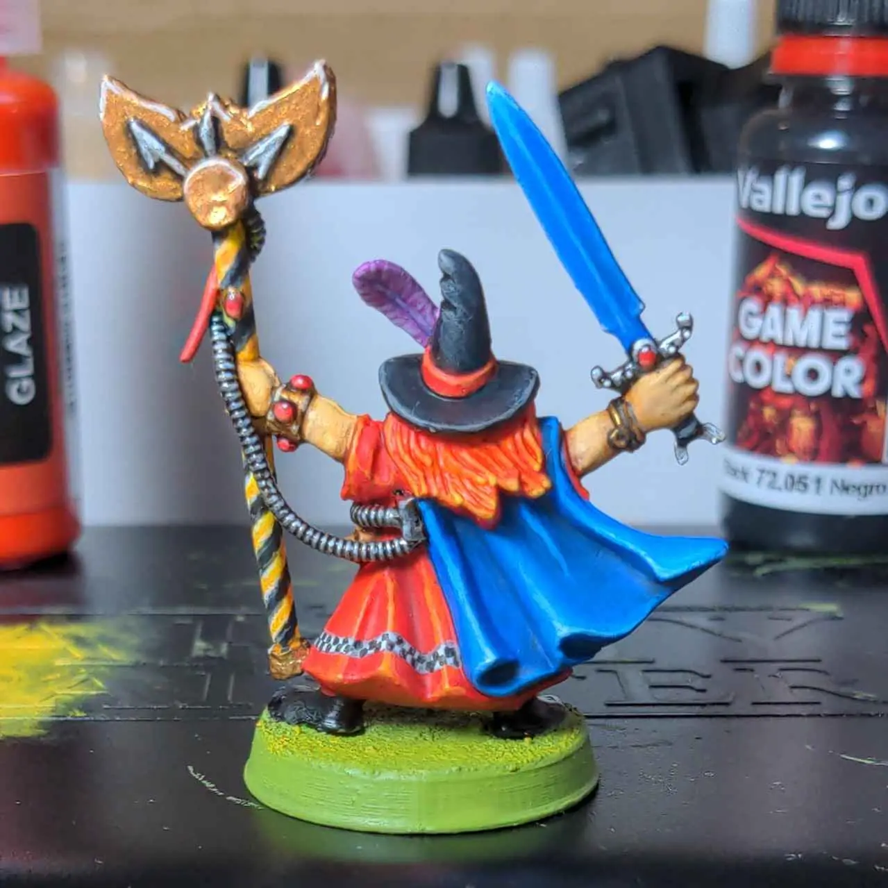
And from behind

The highlighting and edge colors are fantastic. I really like the white on the staff’s hazard stripes, and the highlighting of the eagle in particular.
Cheers, I’m not so sure about the metallics myself. I’ve been getting lessons from Josh at the Crown of Command podcast and he has really pushed my colours and highlighting to the next level, but the next lesson is non metal metallics which I am hoping will really improve that part of my painting as currently I think it is lacking.
NMM is rough. I just about have a basic handle on doing steel/silver, but my NMM gold always comes out awful.
For Oldhammer aesthetics, I tend to stick to true metals though. My go to routine is a red brown base, then a gold metallic coverage, then Citadel Fleshwash contrast paint over top (about the only time I use a contrast paint).
I don’t highlight my gold like you’ve done, and I’m really thinking I should start getting in the habit.
Josh has a really clean simple style for doing NMM that doesn’t look to out of place on older miniatures (you can see it in this video https://www.youtube.com/watch?v=G1OAylxlbyc ) so hopefully I’ll be able do something like that in future.
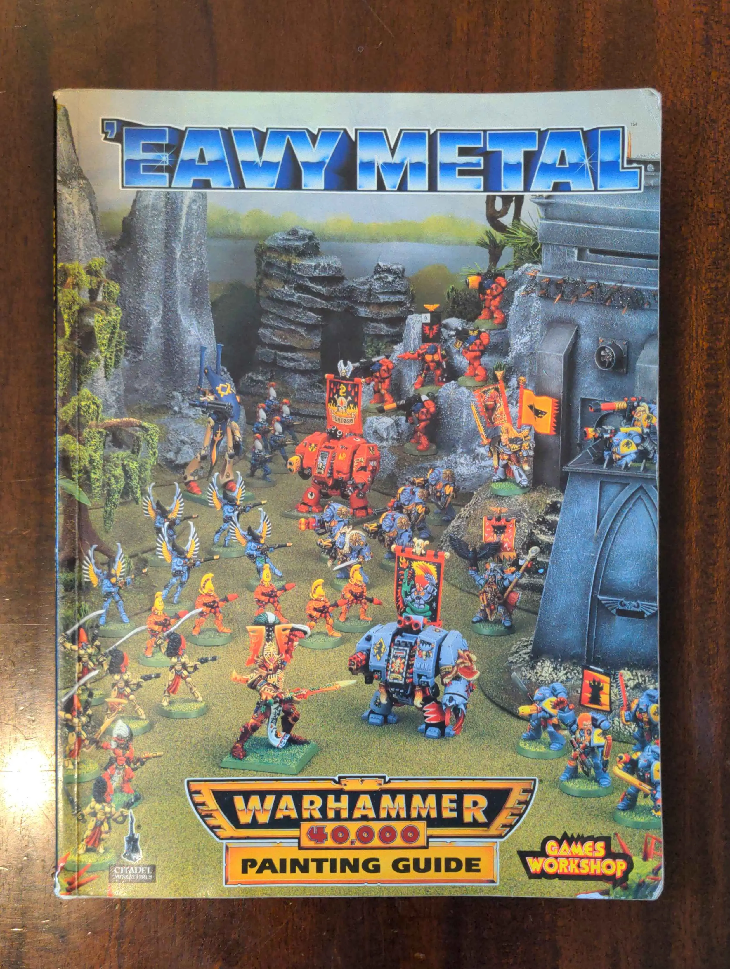
In the painting guide I posted in reply to another comment Mike McVey describes his method for painting gold start with a white base coat then paint a mix of gold and yellow ink over it. That is such a mad concept to me that you would paint gold over white.
I’ve been playing with some over white. It does give super bright results. Most of my focus has been from brown up for darker, more baroque gold and it just didn’t work out, so far. Some day I’ll figure out gold reflections.
Just beautiful.
This is exactly the kind of picture that captured my imagination as a kid.
Me too, everything must be red!
Q: How Warhammery would you like your wizard to be?
A: Yes.
I recently got this book, it may have had a slight effect on my choice of colours

I love him!
Beautiful work as always.


