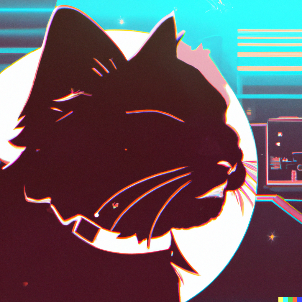
Okay, I get this is totally not a priority, but this app icon bothers me enough that I don’t even want it on my phone’s Home Screen.
I bet you can see why.
Someone is working now to contribute a much better icon for us. Should be done soon.
Nice. Any plans for community icons?
That would be cool custom icons like Apollo had
Awesome!
I can’t see why Why?
I don’t get it either, what a weird post.
Because of the white trim around the icon, which shows that it’s not actually the proper shape for an iOS app icon.
Sorry, that should be kind of obvious just from looking at it.

I actually never noticed it but now I’ve zoomed in on that picture I can see it.
Edit: actually nah I think that’s actually just compression from the screenshot, the other apps look the same and it’s impossible to see it when looking at it on my home screen.
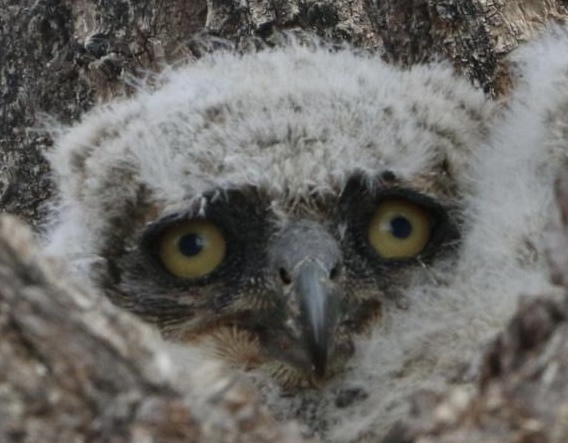
Ohhh, I thought something on the animal was supposed to be wrong
Well… it’s not obvious - that’s why the other poster asked.
That’s the old icon. The new one looks completely different.
Yeah I get the single pixel width border around the corners too. Not a priory, but is a tad annoying.
It’s less noticeable on the home screen than it is on the test flight dashboard. I’m not bothered by it one bit.
deleted by creator


