
You must log in or register to comment.
deleted by creator
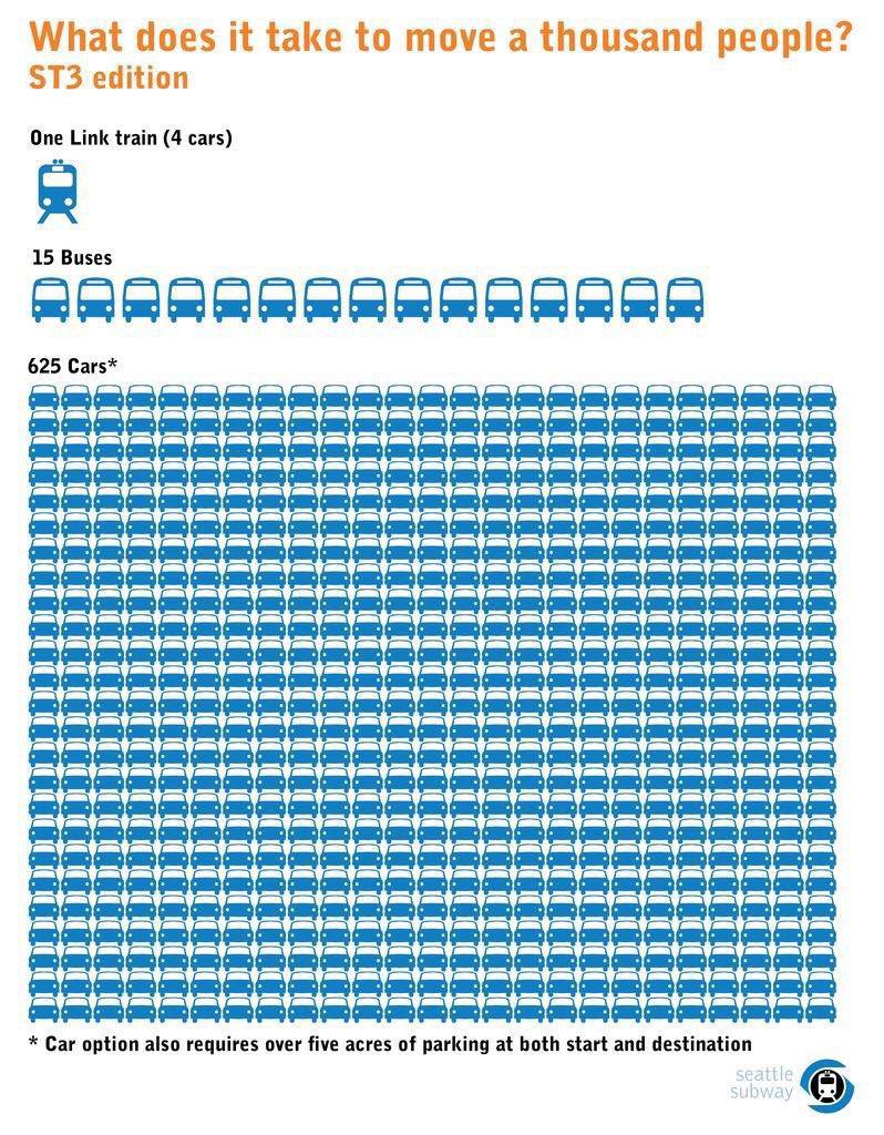
No, if anything you should use the average number of passengers for each vehicle.
deleted by creator
It is a good point. The cars reflect actual usage and the public options reflect capacity. It seems dishonest. In my experience public transport hits capacity regularly during peak demand while cars never fill up, so I think the comparison is valid.
Looking at the source it seems to be an organization focused on motivating people who agree with them (like a fuck cars community) rather than changing minds, and this infographic will do that. I agree that different material would be needed for a contentious audience though.
200 cars is still a hell of a lot more than 15 buses