
I’ve been playing around with Jerboa’s UI trying to make it more consistent and readable
If i press on an image, i want it to be opened within Jerboa. Not exit & open in web browser. Could you & team kindly fix/ consider this?
deleted by creator
deleted by creator
It seems to fix itself with Android 12 and up, not sure what’s up with that but I’ll see what I can do. Thanks
deleted by creator
Wait, you guys can see your notification bar? It’s all black to me, I thought it was some kind of an immersion feature
I made a PR to fix this, hopefully it’ll be on the next update.
If your Jerboa theme is mismatched with your system theme, the notification bar disappears (it’s a bug)
Looks nice. Is this working code in a fork somewhere, or a non-functional visual mockup?
- Most of the changes seem purely cosmetic, but I guess you decided to get rid of the button to list the communities in the bottom bar in favor of having people use the hamburger menu?
- My favorite change is getting rid of the local/subscribed/all button in the top-bar and making the display of what’s currently suggested be a dropdown. That’s much easier to understand, and reduces clutter. Simply lovely.
- The one thing that actually reads less clearly to me is the envelope icon to go to replies/etc in the bottom bar. If I didn’t have jerboa next to me to compare with, I wouldn’t be able to visually parse what that is supposed to me.
Thank you for the constructive feedback. This is not a mockup, it’s functional code. I will publish it and I will try to get it merged once I improve the styling and fix a few crashes. For the last point, I based the icon off of what similar apps like Infinity use. I guess it would make more sense to replace it with a bell or an envelope. Thank you so much for the very constructive comment :)
Good luck getting it merged, I’d really enjoy using these changes.
On the icon I have difficulty reading, maybe it’s just me… go with what you feel is right. I actually use Infinity and I can see now that the icons match. I’ll certainly learn to read it with use and it won’t bother me once I get used to it. But if you’re thinking about a bell as a possible alternative, that would certainly align with the web UI. But subtle choices either way. Looks super great.
deleted by creator
Good job with this! Apparently the inspiration for the Jerboa UI was Boost for Reddit. That’s not to say it needs to be a Boost clone in every single way, but if you want to see why certain decisions were made, it’s a good app to look at. I see that when you made the change to a dropdown for local/subscribed/all, we lost the sub text that shows what the current sort order is (active/hot/etc). I don’t know if that’s difficult to add back, but it’s something I personally would miss.
Please, add the button that I first found in Joey for reddit. Basically what it does is it collapses all previous comments other than direct parents of the comment where you press it. I can make a screenshot or a screen recording to make it more clear.
not sure if it already existed and didn’t work before but THANK YOU for adding the ability to collapse comment threads!
You can hold horizontally by the username to collapse the comment thread
On the newest version, you can tap anywhere on a comment to collapse. I like it because it’s much more discoverable even if people figure it out by accident their first time.
I was trying to do that (used to it from Relay) and was about to ask why it wasn’t a feature. Updating right away.
Why is there no doc on this?
I couldn’t tell you 🤷 I’m not sure if it documented in Boost for Reddit either and I couldn’t tell you how I’d discovered it at this point. But you’re right, I’d say it’s at least worth mentioning in the app description in the Play Store (though the number of people actually read those closely probably isn’t high).
I’ve just joined the community throught Jerboa, I like it but I miss a couple feature, and hope they can be implemented:
I use(d ?) Slide for reddit and a thing I like very much is to be able to fold comment threads so the scrolling becomes a bit more fluent letting me skip threads I don’t find interesting(Edit: I’m dumb, pressing the author name does the job).I’d like to be able to choose default view (Local/All/Subscribed).
Either way, thank you very much for your work so far!
You can change the default view in your account settings, right from the app.
Well, that doesn’t work for me but it’s the same from browser so I suppose it’s not an app problem
I think I know why, I’ve downloaded the latest version from GitHub, and if you’ve downloaded it on the Play Store, it probably isn’t updated yet to the last version, There’s a F-Droid repo that is updated quickly as I heard, but I didn’t try it this way.
No, I’ve downloaded the F-Droid one just today, I don’t think is that. But I managed to change the settings via browser using chromium instead of firefox, even if some buttons don’t work here too. I’m convinced it’s not a Jerboa problem since it reproduces on my pc browser. It looks like some buttons are not fully active
Strange, are you on Jerboa v 0.0.32? I don’t know if changing the option via the website update the setting in the app too
Yes it does, luckly. My version is 0.0.31 but the 32 isn’t available in F-Droid yet, they usually need some time to check the versions, if with the next version it’ll already be fixed il just patiently wait. After all I’m not expecting everything to work immediately in a v0.0.x.
Edit: actually, it only shows the updated configuration in the setting page but still shows the Local as default. I’ll check with the next version if the problem will be solved
Yeah, the Lemmy dev said that the IzzyOnDroid repository for F-Droid has faster updates than the default repository, so that’s probably why.
love the work! Jerboa has always been quite inconsistent, but this makes it much more visually appealing and clear. Can’t wait to see the PR for this :)
Looks good to me
Having an issue with images posting horizontal instead of vertical when taken on my phone. I feel like it’s probably an easy fix, just something being read funny from the meta data or something? Idk I’m not that clever but I would love if someone fixed it.
I know this is probably just me, but could we have an option for a circle button shape? I can’t stand those corporate rounded squares. I’m keeping Keeping a bunch of apps very out of date on my phone from before when they started switching from circles to these.
looks great
thank you for jerboa. one thing i would find convenient would be if it would remember where i scrolled to on a page. e.g. i scroll down on a users posts, i click a link. later i go back to the profile, gotta start at the top again.
When I click to view comments, here’s what I see:
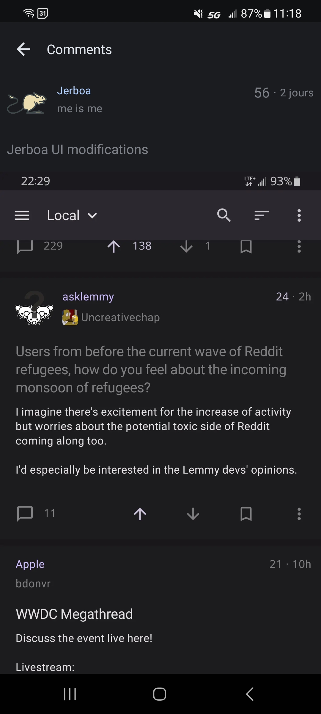
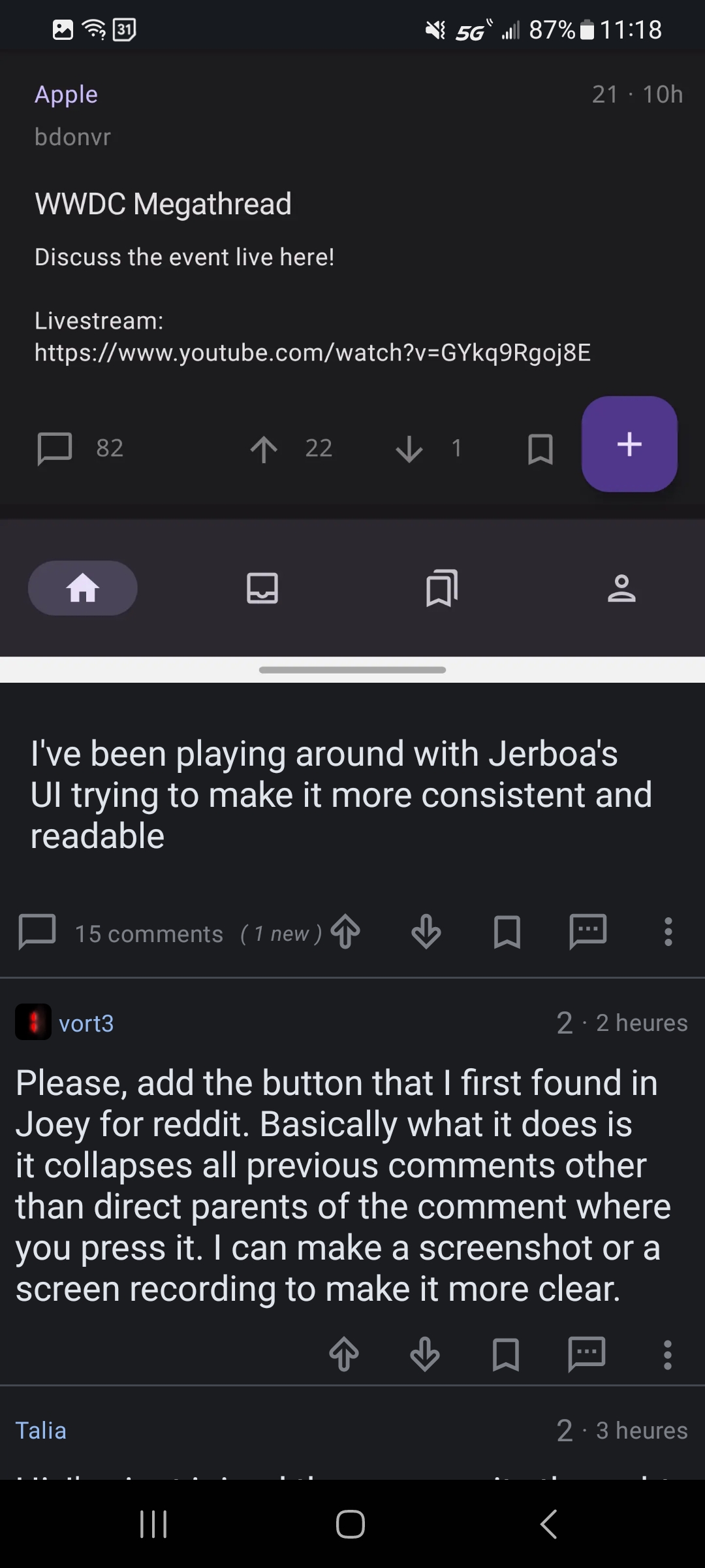
So there’s some extra, unrelated content appearing for me. Anyone else seeing this?
The post you see is a screenshot of the UI results, so you’re not seeing extra content but the whole screenshot. Maybe this can be an insight that the UI needs a way to mark the images as such more evidently, like a lighter shadow or another kind of frame
Oh holy Moses that’s confusing! Thanks, and I agree images need a border or something.


